Maxon - The movie booking website is one of my UX Case Studies for the UX Design Certificate which is taught by Google and issued by Coursera. I conducted this case study on my Web Design Responsive Adobe XD Course. I worked alone on this project and finished all the necessary steps to produce the finished responsive website.
Maxon is the online movie booking website for Maxon cinemas in Ho Chi Minh City, Vietnam which allow users can book movie tickets quickly from their computer or even from their mobile phone with some simple steps. The typical users are from 16-40 years old, and most users are college students and workers who have plans to go to Maxon cinema for watching movies. Maxon’s goal is to make the movie booking process easy, quick, and convenient for all types of users.
Available online booking movie websites have cluttered designs, inefficient systems for browsing and showing movies, content related to movies, and confusing the booking and checkout process
Design a booking movie ticket website that is intuitive and user-friendly. With simple steps, users can explore showing movies quickly, check out more useful movie content, and complete the booking process easily
In to understand the target user and their needs better, I conducted user interviews, which I later translated into empathy maps. I found that many of my target audience prefers purchasing movie tickets online to going to the theater in person. Yet, many target customers were disappointed by the excessive and difficult navigation of the existing movie booking websites. Because of this, users were in a bad attitude and left the sites quickly.

Mike Nguyen is a content writer, he needs a booking movie website with attractive visuals, intuitive navigation, useful movie-related content, and booking flow easily because has less time to browse and makes more clicking mistakes on some available similar websites.

Difficulty with website navigation was a primary pain point for users, so I used that knowledge to create a sitemap. My goal here was to make strategic information architecture decisions that would improve overall website navigation. The structure I chose was designed to make things simple and easy.


Based on the insights from the usability study, I made changes to improve the home page. One of the changes I made was adding quick booking feature on the homepage. This allowed users can quickly book a movie ticket at the homepage

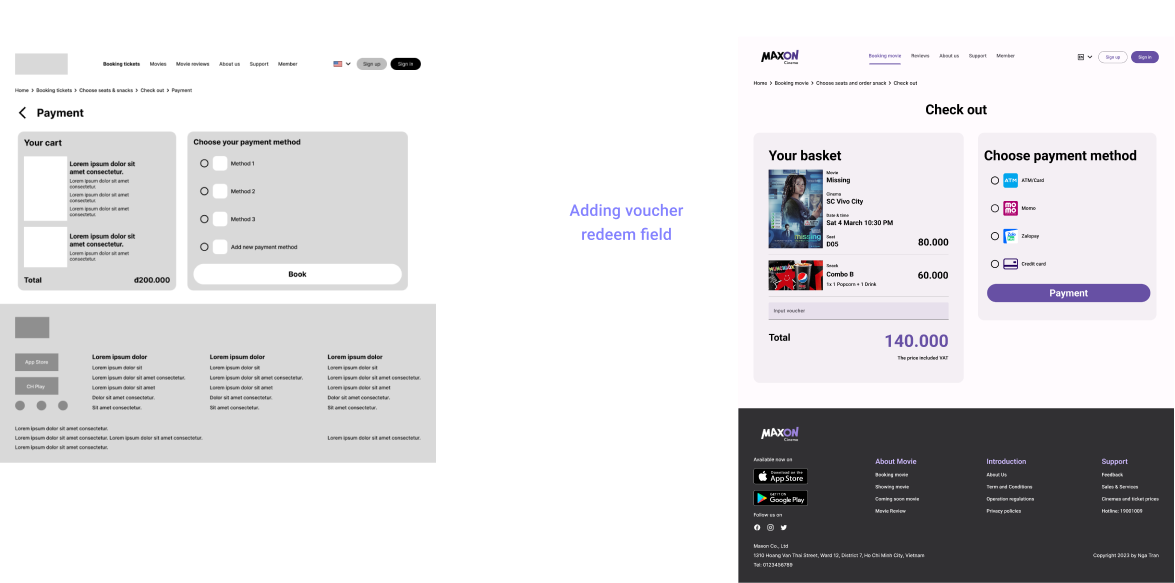
To improve the user’s experience on the check out flow, I added a input voucher field that allowed users can input their voucher code which they had to buy a ticket with a discount price

To help users use the online ticket effectively, I added the guide to use online ticket below the ticket image.

The appearance of the home page is similar to that of a house; I design it to appear more modern, appealing, and yet still simple. Using a strong hero image that is immediately attracting to visitors is the first step. Applying the blur effect at the bottom (color: choose the color of the main movie cover). Finally, emphasize the easily recognizable quick booking function.

The part listing current and upcoming movies is located beneath the major hero section. Four out of five participants in user research want to know what movies are releasing shortly so they can plan their calendar and purchase tickets. These posters are made to appear more real by using a method that makes use of the large movie cover as it looked in the cinema.

4/5 users from the research agreed that they would read the movie review before planning to go to watch it

All currently playing and upcoming films will be listed on the booking movie page, just like they are on the homepage. Also, the top of the page has a fast booking bar so that users may easily book according to their original aim.

The design was well-received by our target audience who found it easy to navigate due to its clear visual hierarchy and intuitive browsing. Additionally, the use of photos made the design more engaging and user-friendly.
I learned that even a small design change can have a huge impact on the user experience. The most important takeaway for me is to always focus on the real needs of the user when coming up with design ideas and solutions.